Friday, 11 March 2011

Semiotics - The Reading Of Signs

This is, with a help from the lecture slides, my reasoning of semiotics, which having got into now, have found to be really quite interesting. I have to say when I got home I thought about the lecture and I was a little confused especially with the keywords and thus their meanings, so as the cloud of doom and despair rained on my parade I decided to revisit the slides and attempt to piece it all together.

Semiotics is relating to the visual language of sign systems, first coined by Ferdinand de Saussure in 1916. 

According to de Saussure a sign has to have three elements or characteristics:
Must haves:
1) A physical form.
2) Refer to something – not itself.
3) Be used and recognised as a sign.

Signifier is the physical form
Signified is the content or concept it represents

For instance a signifier could be a rose and the signified is love. However there is a further element attached to this ‘dyadic’ or two part model. Arbitrary or Iconic.

Arbitrary – where there is no natural link or relationship between the two. However the signifier, the physical form, takes on a signified concept by agreement.

Iconic – this is where the signifier resembles or imitates the signified.

Two examples, one from above, a rose (signifier), in relation to love (signified), arbitrary or iconic; it is arbitrary, it’s just a plant; love has been attached to this plant over time. However is a crown in relationship to sovereignty arbitrary or iconic; it is iconic, though the connection could still be classed as arbitrary, this is a metonymy, as the crown actually refers to and stands for something, as in the monarch.

Denotation – The signifier and the signified together make up a ‘first order semiological chain’, the first order of signification is Denotation, the relationship of the sign to its referent. The sign is what the sign or word stands for.
Connotation – The ‘Second order of signification’ is initiated once the first order has represented is values. This is a more complex relationship between sign and concept, producing expressive shades of meaning.

So finally, signification, the first order of signification denotes or stands for the meaning of a sign. The second order connotes or implies the meaning of a sign.

For further reading
Barthes, R. (1977) Image Music Text. London : Fontana Press.
Benjamin, W. (1936) The work of Art in the Age of Mechanical Reproduction. London : Penguin Books

Tuesday, 8 March 2011

A Night At The Theatre


Accidental Death of An Anarchist, a political farce, written by one of the best, Dario Fo. This blog is mainly about the composition of the theatre set and the ideas getting there as opposed to the content of the play, although the content does have a direct impact on the set.

I was asked if I’d like to design another set, a comedy, a political farce; I like designing for comedies, as I actually enjoy reading the script, not that you have to enjoy the play to design but I tend to have more ideas floating around when interacting with the characters in my head. The director had a few ideas and asked me if any of them were goers, most were, almost anything is possible (within reason), the initial idea was to have the set unfold in front of the audience, the anarchist would talk to the audience and unveil the office from behind graffiti hinged walls, setting up the office in the police station giving the illusion of creating a space for the entrapment, however the final set was static, no moving parts, apart from the rolling building outside of the window, a ‘going up to the fourth floor’ visual play on words, which the audience responded to and found amusing. So the set was approved, a set within a set. For those in the know, the graffiti was separated stage left and right, Right wing and left wing slogans for the parties then active.

So the set had to have enough room for dashing around, doors opening and closing, plus a conga chain involving most of the stage management. Compositionally the feeling is to give the small, in comparison, office space intentionally a boring grey, set prominently in the middle and forward of a mass of anarchic graffiti, both representing that of the anarchist but also that of the instability of the police and the corruption within, heightened by the boldness of the red and black and white. This is as you can see a very simple set drawing the eye into the middle, yet joking comments of 'the actors better perform or they'll be out performed by the set', this most certainly was not the case as the bold slogans brought out and extenuated the performances.

Monday, 7 March 2011

Wheatfield With Crows – The Last Painting of Vincent Van Gogh (maybe).


Vincent Van Gough was not rated when he was alive, unlike, though maybe a tenuous link, Jimi Hendrix, yet through death both are still very much alive and have become house hold names. It seems that death can be the making of you, hell maybe if I croak with a fantastic photo to my name, maybe I’ll go down in the history books, but I very much doubt that, I refer to the history book of course, not the dying bit, that’s a given. I was looking at the print in the wall of my living room of Van Gogh’s ‘Starry Night Over The Rhone’ and then thought of the first episode of John Berger’s ‘Ways of Seeing’, he showed a couple of painting in silence and then told the story, background information or in this case, that of ‘Wheatfield With Crows’, some say that this was the last painting of Van Gogh and that this was the place or similar to where he shot himself in the stomach, dying 2 days later in his bed, however I have read that others say that there were several more paintings after this one. Looking at a photograph of the original, and again referring to John Berger, the painting has such texture and atmosphere, but is still unlinked when viewed on a computer screen; I can only imagine what it must be like to stand in front of it, seeing the thick heavy brush strokes put on over one hundred years ago. Also how the image changes from giving vivid imaginations of running through it, or an image conjured up from reading a book to having an air of sadness that is quite troubling, yet like looking at an optical illusion, the mind can only concentrate on one image or in this case one set of emotions, flicking, even if it is just for half a second, from wonder and awe to sadness and possibly even an emptiness knowing that this was the last one or one of the last and the circumstances that lead to the end, but then flicking back to joy of thinking of all the other wonderful paintings he created. This I feel is the power of a painting or a photograph, a film or moving picture is static and a photo is constantly moving, shifting; a film dictates how you should feel with colour and music or sometimes that lack of both, we watch a comedy to laugh or cheer us up or a thriller to be whisked away into life of espionage that 99% of us can only dream of or read in books, yet a photograph depending on your mood, the weather, the lighting on the surface, even our age and life experiences from one day to the next, year to year can change how we interact with a ‘static’ painting or photo, so next time when looking at a painting you like and have seen before, think how you are reacting or interacting to it from last time, I’m sure it’ll have changed in your minds eye.

Saturday, 5 March 2011

Ways of Seeing - John Berger - Episode 1


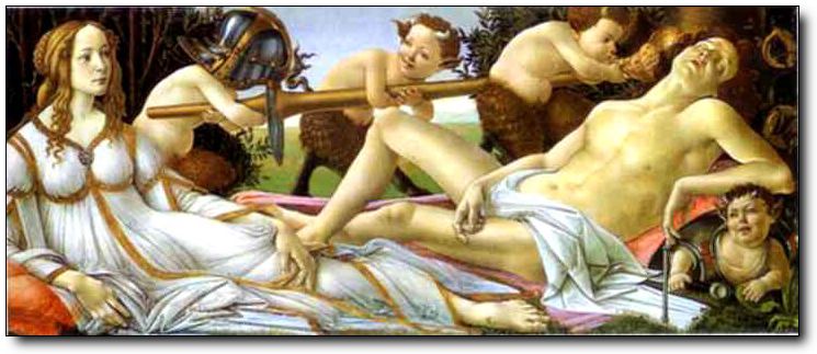
John Berger ran a series of 4 television programs about art, originally broadcast in 1972. Looking at the first program, he was detailing how we look at art, be it photographs or paintings, the originals; he wanted to explain that the original had so much atmosphere, depth and sheer presence first hand, than looking at the original but via a television set. He also showed how an iconic painting or photograph when zoomed in on, through the television or even just cropped can diminish everything that the painting was try to state and how, in this instance, Botticelli’s Venus & Mars when cropping just the head of Venus, she is portrayed as just another pretty woman. This cropping can be done to alter people’s ideas, manipulate they’re thoughts on a subject, the saying ‘the camera never lies’ clearly falls apart with this statement, the viewer can be intentionally mislead to make them come the wrong but intended conclusion just though the simple act of cropping, sometimes it’s not what you show, it’s what you leave out.

The invention of the television and now the internet can now make images, obviously photographs of the originals or copies of copies of copies available to everyone, anywhere at any time, and the image that you can see at the top of this blog is potentially being viewed by someone else right now. The only difference is that the impact the original has, is that it is not surrounded by clutter on a desk, such as tea mugs, staplers, hole-punches, desktop printers and a whole gamut of distracting peripherals. Another element of note is that in a portrait gallery, there is little distraction of sound; you are engaged in the image, taking note of small areas, however never isolating that section from the rest and therefore you are still seeing the whole image as it was intended. When viewing an image via the television, it can be extenuated through panning from left to right and vice versa and so creating, as Berger (1972) says, selecting and rearranging elements to create a narrative and thus creates an unfolding story or even a story board, however there is no unfolding of the story when viewed as a whole, simultaneously. An image can also be manipulated with the use of music, often used in television programs to break the silence and add mood, though an painting can deliver different feelings if for example music from an energetic, lively opera can change the feeling if the music is that of a religious choral piece. In conclusion of the first 156 minutes of the episode it is clear that sound, panning and cropping of paintings can have enormous impact, though sometimes detrimental and mis-leading.

The Ways Of Seeing. (1972) Episode 1, Art in the age of mechanical reproduction. [Television Broadcast]. 1972. UK: BBC.

Saturday, 19 February 2011

Faking It


On the afternoon of Thursday 3rd of February we had a guest speaker to deliver a talk, Dean Loughran from the Bradford Media Museum, who is the Future Strategy Coordinator; this was an interesting talk and covered a few topics, which one part of it was on, what we think is only available to us now via digital technology, the faking of photographs; however this had been happening in the early years comparatively shortly after the birth of photography, for a more recent example were the 2 girls from Cottingley in Bradford who fooled a high percentage of the nation into thinking that there were fairies living at the bottom of their garden, taking in some high profile people, Arthur Conan Doyle for one, however we can see that this is some fairies cut out of a book and propped up, however I fell that it is easier to discredit this photograph now due to this activity happening so much more, that we disbelieve until proven otherwise. Another example is with Henry Peach Robinson in 1862, who created, though not maliciously, a fake photograph from 9 different glass plate negatives, however this was very carefully and cleverly constructed. This just goes to show that ‘faking it’ has been around longer than most would have believe. A more indepth peice on this photograph and Henry Peach Robinson work can be found on the National Media Museums website: Bringing Home The May - Henry Peach Robinson

Saturday, 12 February 2011

Making a photographic statement

On one of my other modules for this semester is a photographic project in 2 parts, the first being to photograph a certain area of Bradford, a page from the A to Z, a ‘journey of discovery’ and reflecting on ‘space and place’, though I am not entirely sure what I am supposed to discover, maybe the aim is to discover myself, though that sounds a little philosophic, a tad too whimsical for my tastes. On my first visit I was not really impressed with the images, still trying to find a handle on the assignment and also what I want to say, I feel the need to document and make a photographic statement as opposed to just fulfilling the brief and scraping through, trying too hard has been mentioned more than once. I will say that for students reading this, talk to your tutors and equally as important, talk to your class mates, sharing ideas has given me a small nudge in the right direction, broken windows, litter, old and new building standing next to each other, lack of use of public facilities such as playground and parks. However for part two, I do have a subject, that came to me relatively easier, after some searching and researching on the internet I am intending to photograph landscapes steeped in folklore and or ghost stories, attempting to show how dramatic gorges and naturally born almost symmetrical hills can create wonderful and sometimes spine chilling stories; my intended area is The Barden Triangle and very much looking forward to getting out there, maybe I’ll get a snap of the Barden Bargest.

Saturday, 5 February 2011

Bill Owens


In my last blog I mentioned Bill Owens, one of his stand out projects was Suburbia, a collection of photographs taken in a cul-de-sac in the 1970’s California, these were just ordinary people, living good quality lives; he was able to gain their trust and show an insight and personal aspects of their home life. Last semester we, the photography students, had a couple of talks given by Donovan Wylie, the current fellow at the Bradford Media Museum, showing us environmental portrait photography, one picture of many he showed us was this one, which as he rightly said, not a square inch was wasted, if you were to see this as a snapshot in a family album, you would be really wowed. The use, whether intended or his preferred film, of black and white draws the viewer to look at the content and take in the textures which are incredibly rich, as opposed to being distracted by the colours. I think you’ll agree that this is quite an intimate picture, quite possibly barbequing for Bill as well. And as usual, though maybe a little sexist, the chap driving the BBQ, which to be fair, is a common occurrence when you next peek over you garden fence to see your neighbours having burnt offerings.